Project Two:
Create a Responsive Website | Art Auction
November 2023
The goal of this project is to build on the prompt of Project One by creating a responsive website. Just like the app, the goal is to help patrons and gallerists navigate through the nuance of placing bids on art from established and up and coming artists. This creates an intuitive space to participate in art auctions.
Below illustrates an overview of the design process with links to the low and high fidelity prototypes, followed by a link to the full portfolio project.
Paper Wireframes
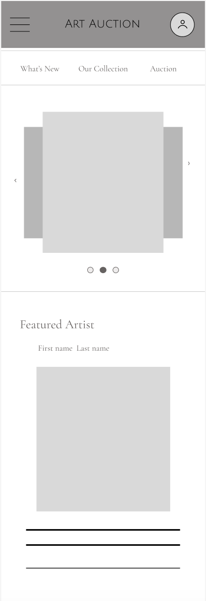
Paper wireframes were created for a website that adjusts according to the device being used. For this purpose, wireframes for a desktop, tablet, and mobile phone have been created. Each have a similar layout to the app to maintain brand awareness.
Digital Wireframes
Based on the paper wireframes, digital mockups were created for a desktop, tablet, and mobile device. The homepage remains consistent but adheres to device dimensions. The low-fidelity prototype linked below shows the user flow for a desktop.
Final Mockup
The final mockup was developed in the same style with the color scheme and typography corresponding to the app. The website has been adapted for the three devices and appeal to their respective dimensions. The link to the high-fidelity prototype illustrates the navigation process on a desktop.
For the full case study and explanation of this project, please follow the above link. Thank you for taking the time to view this project!


